Outcome
Problem & Context
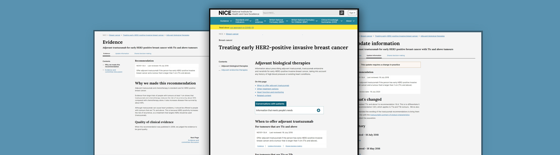
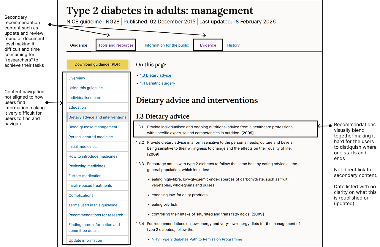
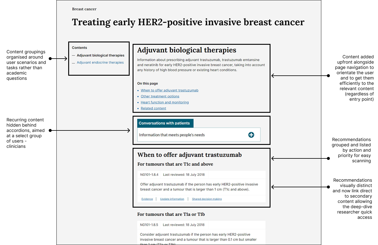
NICE Guidance is authored as static Word documents and published as fragmented HTML. This "document-first" approach resulted in poor discoverability and excessive time-on-task in high-pressure clinical environments.
Previous survey research gave indication that transitioning to a dynamic, layered content would reduce broken user journeys, and improve user speed-to-answer.
To protect the integrity of NICE's core offering, we needed to move beyond static publishing to a model that serves our users: the time-poor clinician (instant answers) and the academic researcher (deep-dive evidence).
Before
My Role
- Led the redesign of the end-to-end user journey, optimising the content funnel which has resulted in a 23% reduction in 'time-to-answer'.
- Synthesized complex clinical evidence into structured content models that mirrored real-world medical decision-making, leading to a 12% increase in successful task completion.
- I de-risked a transformation of NICE's publishing and clinical guidance model to deliver the UX proof-of-concept required to secure £1M+ in funding for a new CCMS.
- Embedded collaborative rituals and continuous research loops, speeding up iteration cycles and fostering alignment between multi-disciplinary teams and stakeholders.
Approach
- Prioritised and validated user insights to develop journey maps for core archetypes: the "time-poor clinician" and the "deep-dive researcher" to inform design strategy.
- Established baseline UX metrics, measuring time-on-task and completion rates to quantify the friction in the current experience and track transformation success.
- Simplified topic content and hierarchy to align with the new content model, ensuring it met user needs and internal publishing workflows.
- Reframed assumptions into measurable hypotheses, using prototypes to stress-test assumptions and safely de-risk the transformation of NICE's core publishing model.
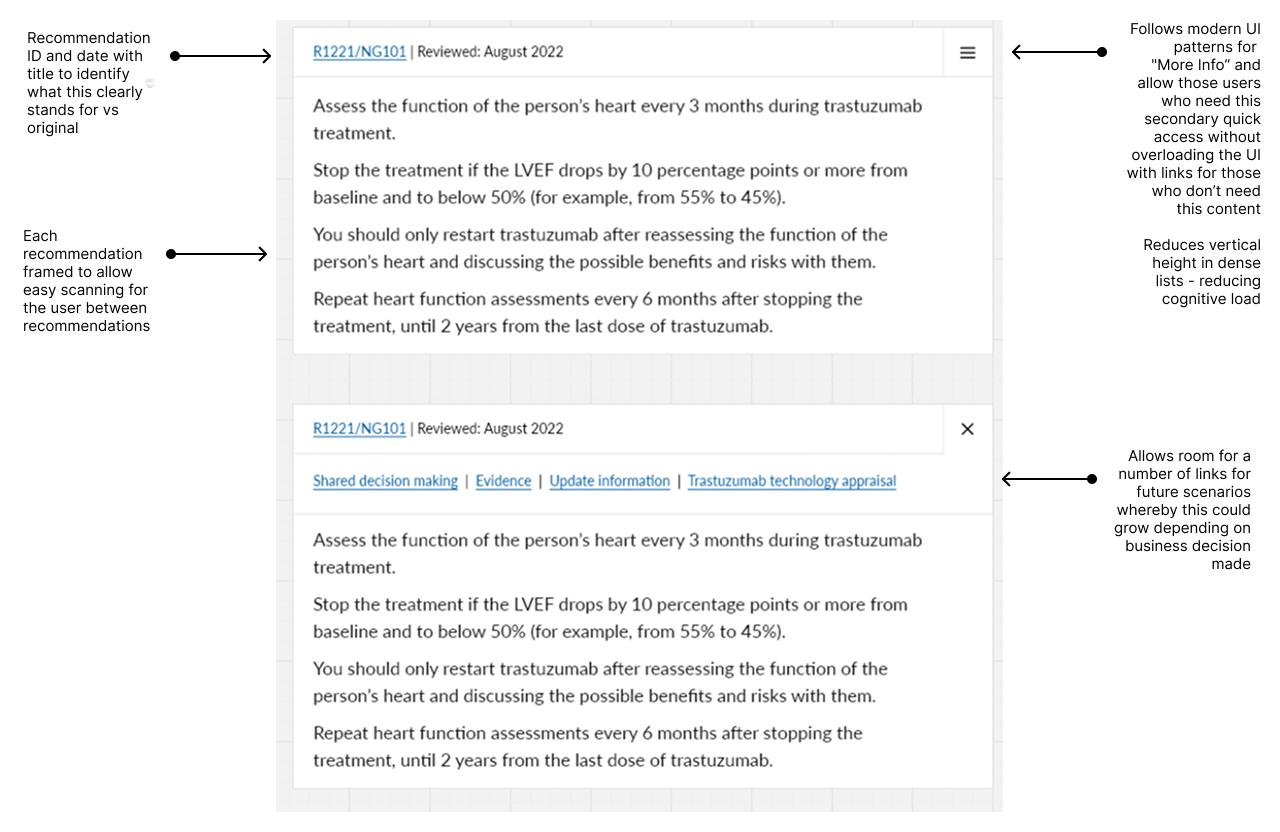
Recommendation card - Iteration 1
The aim was to balance the needs of both researchers, who require access to deeper, more detailed layers of content, and time-poor clinicians, who need to quickly scan and extract essential surface-level information.
This approach keeps pages visually minimal and clean, aligns with modern UI patterns for “More Info,” and reduces vertical height within dense lists, making content easier to navigate. By progressively disclosing information, it also helps reduce cognitive load, particularly on content-rich pages where similar components are repeated frequently.
Hypothesis: Introducing progressive disclosure through “More Info” patterns will improve content accessibility and usability by enabling clinicians to find key information faster while still allowing researchers to access deeper detail when needed, ultimately reducing cognitive load and improving task completion efficiency.
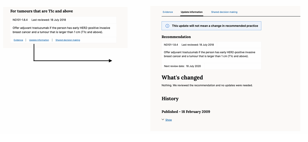
Recommendation card - Feedback and iteration 2
User Feedback - Users did not intuitively recognize that critical supporting information was housed behind an icon. This discoverability issue led to, increased time-on-task, and a measurable reduction in overall task completion"
Decisions based on feedback - Exposed all supporting links and clinical evidence directly within the recommendation card, removing the hidden menu to prioritise transparency and immediate speed-to-answer. Also Ordered supporting links strictly by user need and business criticality
Output
Constraints
Because of NICE’s clinical governance and approval processes, we knew we couldn’t directly rewrite the clinical recommendation content. Instead, we focused on improving the surrounding experience—such as progressive reveal of evidence layers, clearer orientation text, and more effective microcopy. Working within these constraints, we were still able to achieve a 12% increase in task completion.
We were designing for two user groups with competing needs: those wanting quick, high-level answers and those needing detailed evidence.I tested a minimal UI to support both—allowing users to scan and reveal more detail on demand—but feedback showed this created too much uncertainty.
So we adapted the design to surface key links upfront, ensuring it supported both quick scanning and deeper exploration.
What I Learnt
- I learned that when clinical risk is involved, "obvious" is always better than "elegant". My initial assumption for a clean UI was corrected by the reality.
- I realised you don’t need the answer to every edge case to provide value. By building with "knowns" and rigorously testing with users, we were able to iterate and move forward.
- Early stakeholder alignment is essential but requires more than just a meeting, it requires navigating resistance through the building of relationships and forming trust.
- I found that multidisciplinary design reviews drift without structure. I’ve since redesigned our crit format to provide clear guardrails across the team.